When it comes to fashion criticism in the year of our Lord 2020, the first place you need to turn is...a sports site?
That's right. We here at Cougar Sports Insider don't just pride ourselves on top-notch reporting on BYU Football. We've done our research and are prepared to tell you what's what when it comes your important couture-related decisions. We'll at least what you should pick and avoid when it comes to your BYU Football gear.
Every year around the fall season athletic apparel brands release their seasonal gear that coincides with the start of football. For BYU this means we get to feast our eyes on the latest and greatest gear that our good friends at Nike have to offer.
This is usually a joyous occasion but this year is anything but because Nike really laid an egg this year.
The stuff is bad. Like "this looks it was designed by Russell Athletic" bad.
I know that might sound a little dramatic but just take a look at some of this stuff. And before you get all huffy and wonder why BYU picked such poor apparel, know that this is the standard fall lineup across all Nike schools. If you check out USC or Texas you'll similarly terrible items.
HOODIES
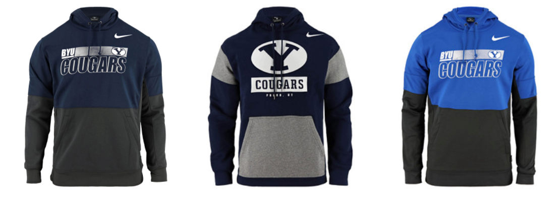
The hooded sweatshirt is a classic fall item that's generally hard to mess up, but Nike accepted the challenge and rolled out these turds. For some reason they went ALL IN on the two tone look and decided to mix a whole lotta gray with their hoodies. Between all of the gray and the incredibly busy logo and type layouts, it's just a mess. Gun to my head if I had to purchase one of these I'd go with the royal hoodie on the left but it would probably stay in the closet next right next to my 1999 bibbed jersey.
WHAT YOU SHOULD GET: None of 'em.
WHAT YOU SHOULD AVOID: Every hoodie is bad but the navy with light gray accents is THE WORST.
OVERALL GRADE: D-
JACKETS
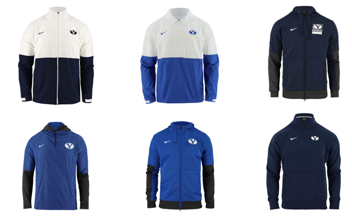
The jackets are slightly less offensive. You'll notice that Nike brought back the split color look that they used on the sideline polos and used them here with the jackets. I think this approach looks much better on a polo (the two color sleeves look funky) and I'm not a huge fan of the shirt collar used with the royal jacket. Is it supposed to be half football coach / half high councilman? The other two royal jackets would be perfectly fine if they were all royal. Because of the color pairing it looks like you'd be wearing a shirt on top of a long sleeved shirt. Maybe this look is back in style but I'll pass. I'm became a dad this last offseason so maybe I should just give up and start wearing the bland navy pullover in the bottom right. At least it doesn't have any wild gray patterns.
WHAT YOU SHOULD GET: If you absolutely have to buy something, get one of the royal jackets. Or just wait until next year.
WHAT YOU SHOULD AVOID: The navy / dark gray jacket with the Y logo and Cougars. Too much going on there.
OVERALL GRADE: C
SHIRTS AND SIDELINE POLO
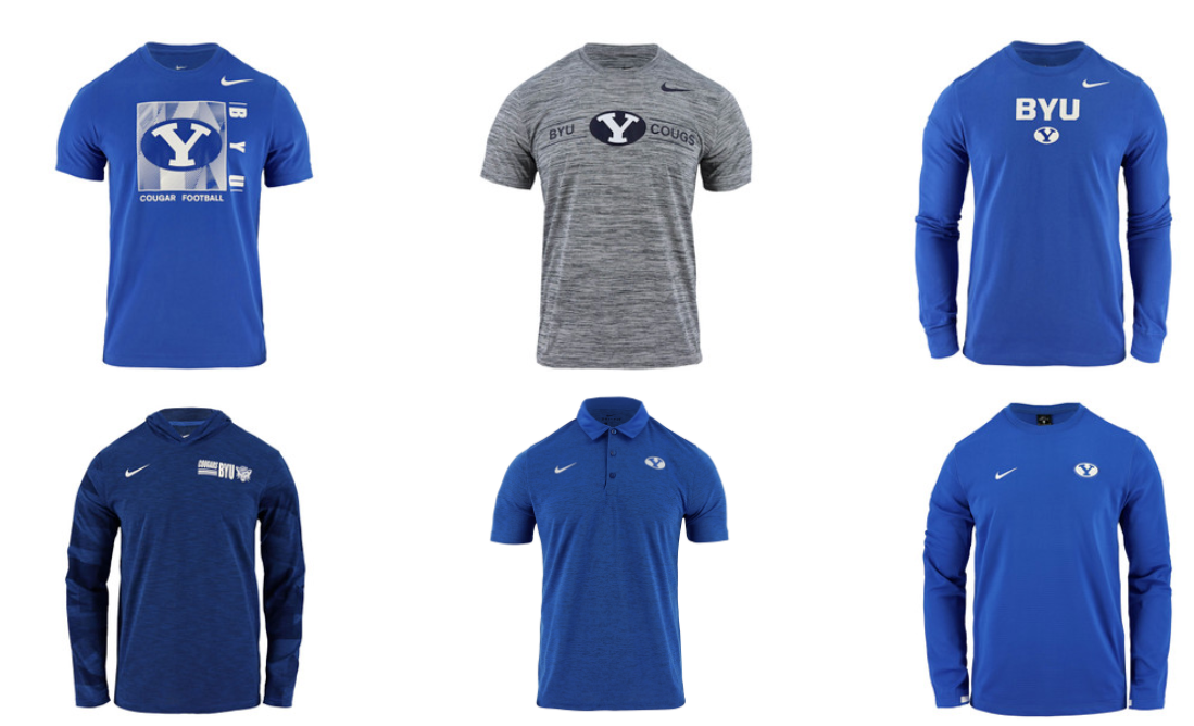
Let's start with the t-shirts because those belong in the garbage can. I don't know why you need to put a huge stretch Y inside of a box with some strange design. It's bad. And the gray heather (camo?) shirt next to it is just as bad. The stretch Y should never be in the middle of a shirt at that size. The royal polo and long sleeved shirts are the only items I would consider buying. I really like the block BYU letters on the long-sleeved shirt but I'd love it even more if they stretch Y was gone.
WHAT YOU SHOULD GET: The royal long sleeved shirt with the block BYU letters is a solid look.
WHAT YOU SHOULD AVOID: The t-shirts should be sent back to Beaverton.
OVERALL GRADE: Long sleeves get a B+, and the polo gets a B but the t-shirts? An F.
HATS
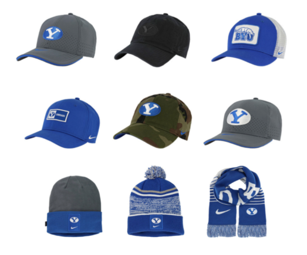
You can tell Nike really went back to the well with the gray theme this year. It's all over the jackets and a big part of the hat collection as well. I'm not a huge fan of the oval / stretch Y unless it's on a helmet. That logo was made to be a perfect helmet decal. On a hat? It's OK. If you're going to have the stretch Y on a hat, it should be small accent like they have on the beanies. I want to like the gray hat with the royal oval and white Y but it's going to feel dated after one year. I feel like I would need to see the black hat in person before purchasing and the camo hat is will always be strange to me. I have lots of love for the digger cougar logo but on a trucker style hat? Pass.
WHAT YOU SHOULD GET: The knit beanie and the royal hat with the smaller stretch Y in the box are the least offensive.
WHAT YOU SHOULD AVOID: The gray hat with the white oval. Woof.
OVERALL GRADE: C-
****
So there you have it. A very mediocre fall lineup with lots of forgettable designs. I was going to consider reviewing the women's apparel as well but I'm already out of my depth talking men's fashion. I'll say this, there are plenty of other great offerings, Nike or otherwise, available for BYU fans to pick up. They're just not part of this fall collection.
September 28, 2020 at 05:31AM
https://ift.tt/3j7DFhu
Nike's new BYU Fall gear is here! Let's have a look. - 247Sports
https://ift.tt/3g93dIW
Nike
No comments:
Post a Comment